Icefall UI Evolution
Taking a break from coding topics, today’s post explores how Icefall’s dialog User Interface (UI) has evolved over the course of it’s development. My automatic-backup tool keeps every version of Icefall available, so I fired up a few old versions and took some screenshots to illustrate the process.
Original Design

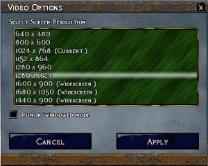
This screenshot is actually from the realtime Icefall prototype. I needed a quick way to change screen resolutions for testing, so this is it. Some interesting features: The green background would slowly sway while the dialog was open, and there was a shimmering gold border around whichever element had keyboard focus.
Revision

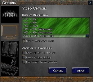
Fast forward to the turn-based rewrite of Icefall, and this is the original Video Options dialog. Some big changes: the background texture is more subdued, there is a panel on the left to select what type of options to view, and the gold-edge focus indicator has gone (now, the focused element is just highlighted a little more). Buttons and checkboxes have also had a minor makeover, e.g. the buttons are now rounded.
Revision 2

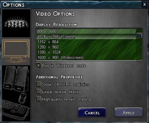
What changed here? The window frame! Gone is the ‘rusted steel’ frame from the top and bottom of the window, replaced with an ice-blue frame that encloses all four sides. I wanted to get more “ice theme” into the UI for the game, and at the same time I needed a UI frame that covered the left and right too, because not all UI elements use the slate background (the spellbook, for example, uses a ‘book’ background, and it looked a little strange with no enclosing frame). I also think this looks better than the previous one.
Current Design

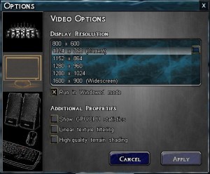
Good, the rate-of-change of the dialog is slowing down, which means we’re getting closer to completion! The only change here is to the background of the listbox. The ‘green waves’ looked ok in the original version, but as the look and feel of the rest of the dialog evolved, it began to look more and more out of place. When the dialog frames turned ice-blue, it was a good opportunity to build on that existing colourspace and again lend more of an ‘icey’ theme to things by using a dark, ice-blue texture. This is what this dialog looks like in current builds. Hopefully, you agree with me that it’s the best looking of them all?